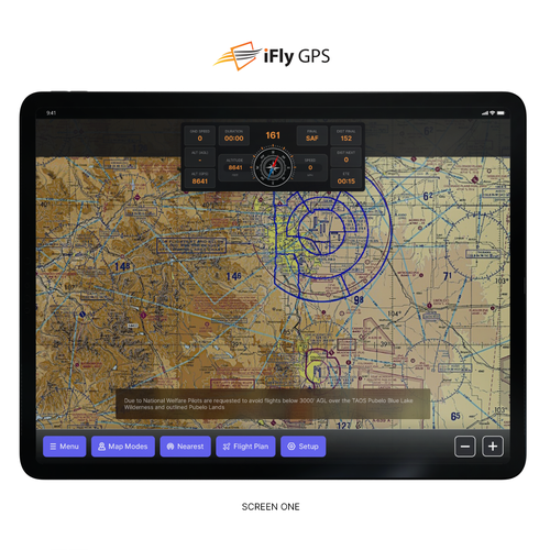
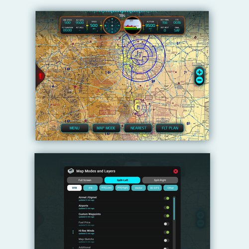
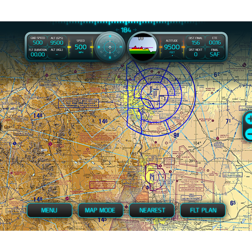
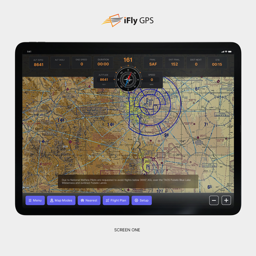
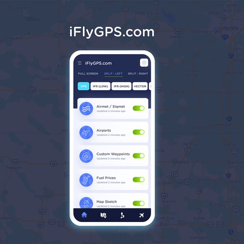
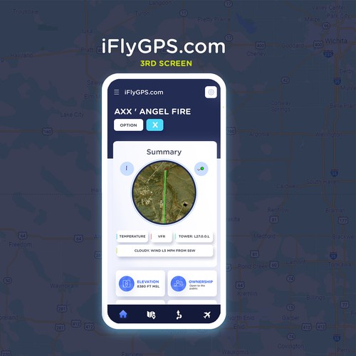
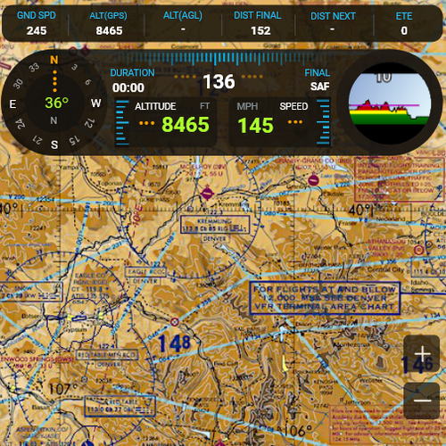
该应用程序将在飞行中的小型飞机上使用,所以用户可能会在湍流和明亮的阳光下跳跃。基于这些原因,颜色需要有高对比度,按钮要大且易于触摸,字体要大等等。依次,这些是我的要求:-干净,直观的界面-高契约,在粗糙的环境中可用-商业的,有一个小的触摸的flare我上传的图像是这些表单的开发人员原型。
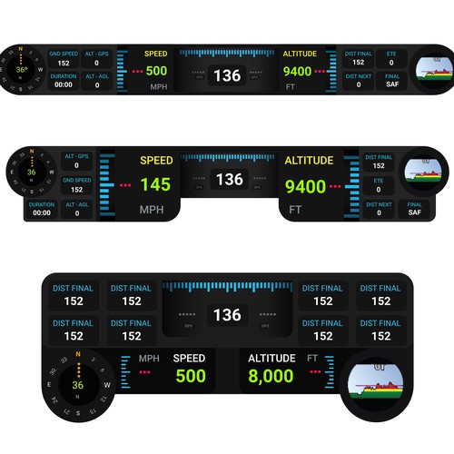
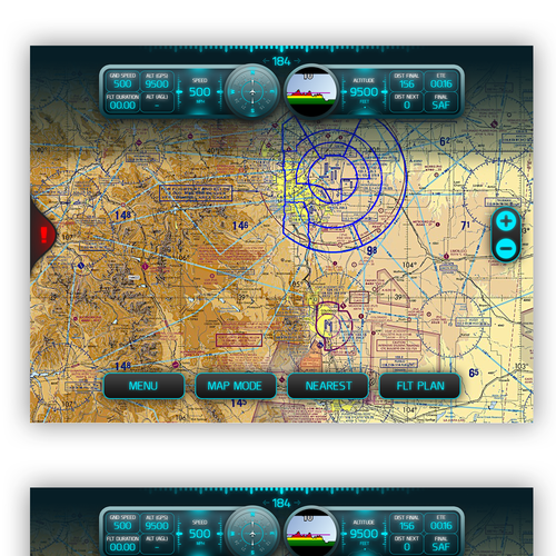
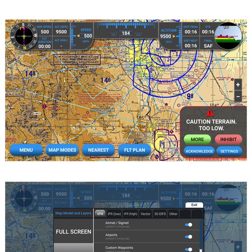
我上传的图片是开发人员的原型,他们不打算是最终设计。只有这个应用程序的总体布局和流程是固定的-按钮如何看,列表如何处理,选择的项目如何看,颜色,字体等,由你决定。我将在每个屏幕上详细说明我喜欢和不喜欢的东西。这些镜头来自一个9英寸的安卓平板模拟器。屏幕1:地图屏幕。忽略地图,我感兴趣的是你在屏幕顶部的仪器堆栈,底部和两侧的按钮,以及弹出的警告表单的设计。我喜欢/不喜欢这个页面的地方:它很容易缩放不同大小的设备(在这个页面顶部的仪器块会滑得更近,使中间的仪器更小/更大,这很好。竖屏时它们堆叠,见1b)。我喜欢仪器标签和内容的颜色不同,重要的内容很容易看到。我不喜欢棕色的轮廓。 A possible “touch of flare” here could be a wood grain instrument outline, but need to consider how that would scale on smaller devices without simply making everything smaller. The buttons along the bottom are a little small, but they are obviously buttons, and they scale easily with portrait or different size devices. Don’t like the brown outline, but they are high contrast and easy to see. The zoom in/out buttons on the right side are floating buttons, they will be there on certain maps (and there are other floating buttons that may appear) - these are a bit lost due to the transparency. The “Alert” box at the bottom of this form pops to give the user important information. I don’t like how it looks like a giant button, and too much empty space. This just needs to be reworked. Screen 2: This form allows the user to change the base map, select/deselect layers, and drill into additional settings for each layer. It's accessed by touching the "Map Mode" button on the main map page. It has 3 sections: The first section is tabs that change the map from 1 full-screen map, or 2 different maps. The 2nd section, “VFR”, “IFR”, etc…this lets you change the base map. And the 3rd section is a list of optional layers, which is specific to the selected base map. This section scrolls, there could be 15-20 different layers. What I like/don’t like: But the different sections of this form seem to bleed together, it’s easy to miss the top tabs entirely. The Base Map buttons (VFR, IFR, etc) are washed out, except for the selected one. Need a few more items to show up on the list of layers, so each of those items can be a bit smaller. And the meta-data about the layer shouldn’t be as bright as the layer name (example “Airmet / Sigmet” is a layer name, “Updated 2 minutes ago” just gives the user a bit of nice info that the data was recently updated…this can be smaller/greyed out a bit more). Screen 3: This is the Airport Information form. It's a tall scrollable page with lots of data to show, most in a grid-like format. This can be a very tall form, it’s scrollable – see 3b, 3c, as I scroll through this form. Starts with a thumbnail image of the airport and the most important information. The additional details follow, mostly in label/data format. I like the high contrast of this form, and the section labels are clear. I like how the map is greyed out when this form pops (we do that for all pop-up forms). The “Options” button at the very top of this form is actually important, and it seems a bit too small and lost. The Close button (the “X” at the top/right) closes the form – this is a pattern throughout the app. Need to make sure this is obvious and easy to touch, and not easy to accidentally touch. It’s not obvious that this page scrolls…need to solve that. Scroll bar perhaps? Or we could “bounce” the scrollable content when the form first pops up to make it obvious it’s scrollable. Would like your thoughts on that.
